Color is the effect on our eyes when we perceive light waves of differing frequencies. Objects that appear to have color are reflecting the colors in the light that illuminates them.
III. Examples of the term:
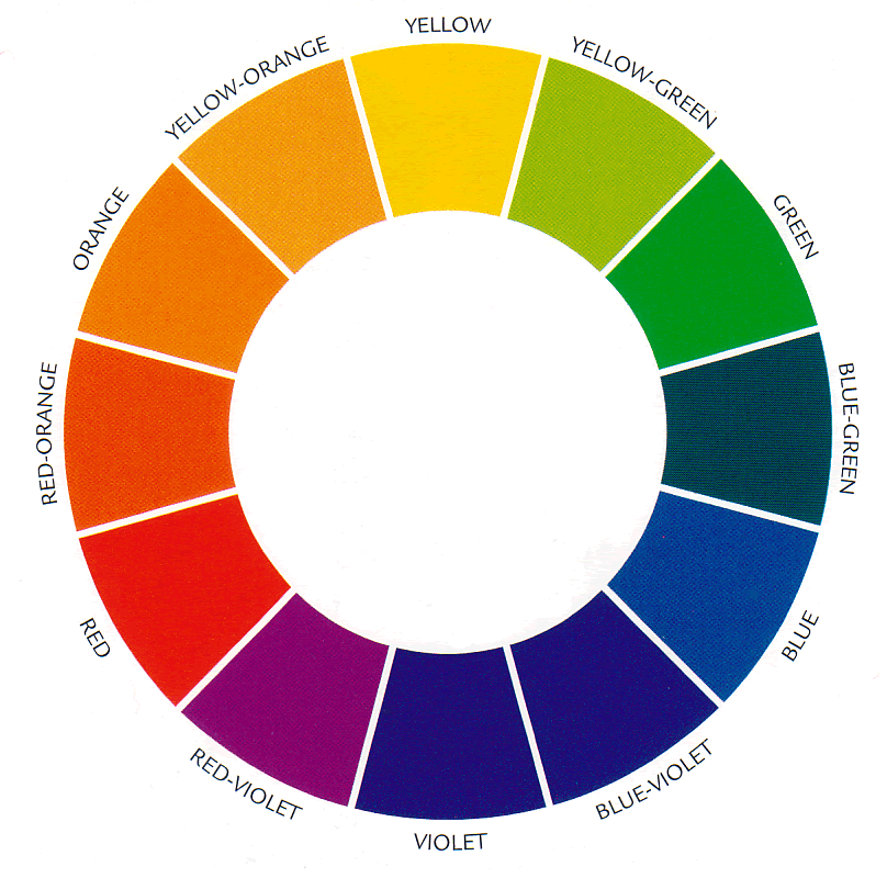
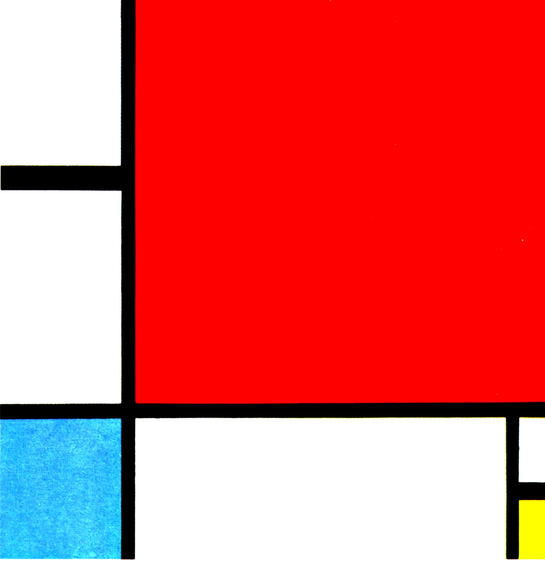
PRIMARY COLORS
Red, Yellow, and Blue
(Piet Mondrian Composition with Red, Blue, and Yellow 1930)
Primary colors are colors you cannot get from mixing any other colors.
You must have these colors to begin, and with them, you can create all the rest of the colors.
If you are a starving artist and can only afford 3 tubes of paint, I advise you to buy one red, one yellow, and one blue!
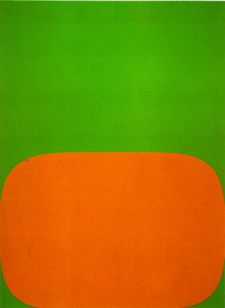
SECONDARY COLORS
Orange, Green, and Violet
(Ellsworth Kelly Orange and Green 1966)
Secondary colors are made by mixing two primary colors.
On the color wheel you can see the secondary color is in between the primary colors you would combine. Red mixed with yellow makes orange. Yellow mixed with blue makes green. Blue mixed with red makes violet.
TERTIARY COLORS:
Tertiary colors are made by mixing a primary color and an adjacent (i.e., neighboring) secondary color. For example, when you mix the primary color red with the secondary color orange you get the tertiary color, red-orange. Notice that all of the names of the tertiary colors start with the primary name.
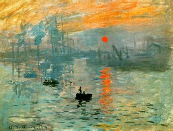
COMPLIMENTARY COLORS:
Red & Green, Blue & Orange, Yellow & Violet
(Claude Monet Impression Sunrise 1873)
Complimentary Colors are OPPOSITES! They are located directly across from one another on the color wheel.
A color is intensified when it is seen beside its compliment.
In the painting above, Monet used the complimentary colors blue and orange. Both of these colors seem more intense when used together. The orange sun seems even more orange when it is surrounded by blue.
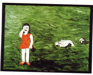
(Neil Jenny Girl and Doll 1969)
The visual impact of a work is often intensified when the artist uses complimentary colors.
This image of a decapitated doll and crying little girl is already a bit disturbing. Neil Jenny's juxtaposition of complimentary colors (red and green) exacerbates this effect.
I think it would be quite different if the girl's dress and shoes were blue.
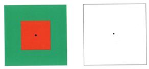
AFTER IMAGE EFFECTS and COMPLIMENTARY COLORS:
Complimentary colors can be seen in afterimage optical effects. In an afterimage, colors reverse to their compliments.
The best way to understand this concept is to experience it for yourself.
Stare at the green and red square for a minute or so.
Then, quickly glance over to the white square and notice how the image changes.
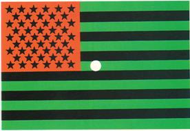
Try the experiment again with this next image.
Stare at the flag for a minute or two.
Then look quickly down to a black sheet of white paper.
You should see the recognizable red, white and blue in the afterimage.
MIXING COMPLIMENTARY COLORS:
Although complimentary colors intensify when they are placed side by side, mixing them together lowers intensity. Combining complimentary colors produces dull browns. This is why many children end up with brown mud puddles when they finger-paint!
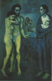
ANALOGOUS COLORS:
Analogous colors are NEXT TO EACH OTHER on the color wheel. When an analogous color scheme is used it often creates a soothing and harmonious effect because the sequential colors look like they belong together.
(Picasso La Vie 1903)
This painting uses an analogous color scheme.
The colors that dominate are yellow-green, green, blue-green and blue all adjacent on the color wheel.
(It probably does not surprise you that Picasso painted this during his Blue Period.)
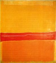
WARM COLORS:
Red, Orange, and Yellow
(Mark Rothko, Number 22, 1949)
The warm colors are red, orange and yellow.
Most people associate these colors with things that are hot to the touch.
These are colors you see in flames or heated metal (think of an electric burner).
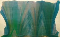
COOL COLORS:
Green, Blue, and Violet
(Morris Louis, Tet, 1958)
The cool colors are green, blue and violet.
These colors tend to be associated with things that are cool in temperature.
You may even have a faucet on your sink or shower with a blue ring indicating the cold water.
Cool colors tend to be soothing.
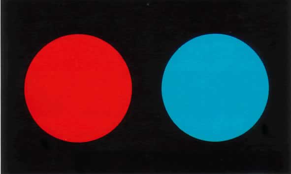
EFFECTS OF WARM AND COOL COLORS:
For most people, warm colors tend to stand out or project while cool colors tend to recede.
Think about the colors that are used to get your attention in traffic. Most of the lights and signs that grab your attention as you drive are warm colors. RED signs and lights are particularly important to notice!
Does one of these circles seem closer to you? The red circle seems closest to me.
Test the theory again with this painting.
(Hans Hofmann The Gate 1959-60)
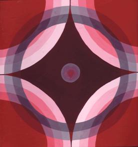
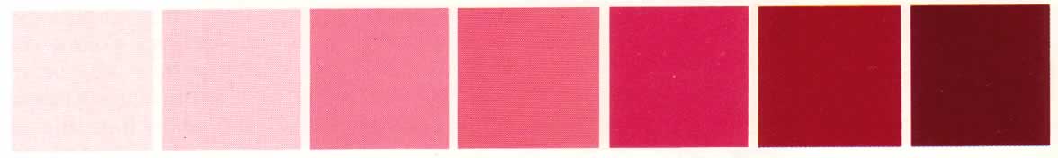
TINTS AND SHADES/ MONOCHROMATIC COLOR SCHEME:
This painting uses a monochromatic color scheme. A monochromatic artwork uses only ONE color (i.e., hue) from the color wheel.
Tints of the color are created by adding white. Adding black creates shades.